Friday, December 15, 2006
Wednesday, December 06, 2006
Even more lifedrawing
Monday, December 04, 2006
Wednesday, November 29, 2006
Ohhhhhh!!!!! Dr. Zaius! (Dr. Zaius! Dr. Zaius!)
Monday, November 27, 2006
Karlov?!?!....FRANKENSTEIN?!?!
Wednesday, November 15, 2006
The Uphill Battle Continues
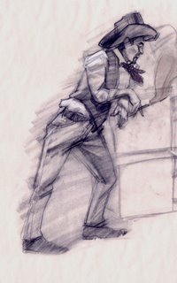
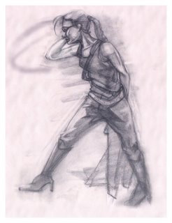
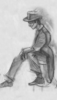 Decided that this lifedrawing was post worthy. Just a lil something for the masses to keep track of my progress. Gotta say that the model duo today was really fun and looked like they had a good time getting into character. That energy most definately translates into the drawing.
James Robertson (Animation Alumni, Pixar Artist) came into our lifedrawing class today, speaking words of wisdom. For all those who missed it, you can find his blog here:
http://theironscythe.blogspot.com
Sunday, October 29, 2006
Dear Sir or Madam will you read my book?
Saturday, October 21, 2006
No Barber? No Fireman?
Wednesday, October 18, 2006
Sunday, October 01, 2006
Rabbit
Tuesday, September 26, 2006
Monday, July 24, 2006
What the hell?!?! a new post?!?!
Alright, So i've been slacking with the posts. All i'll say is that im working on a CG animated short that will be released late august/early fall. We're looking to enter it into the 2007 Siggraph festival. I'm really excited about what we have so far, but I can't show you guys anything till then...sorry :(
The Untouchables - Fall 2006
The Untouchables - Fall 2006
Monday, March 27, 2006
Saturday, March 25, 2006
Mad as hell, and he aint gonna take it no more.
Tuesday, March 21, 2006
Free Samples only from Supermarket Fresh!

Don't lie, you watched this show. Anyway, no that IS NOT my work. I don't want there to be any confusion otherwise. But I do want you guys to know that I've uploaded the legend of zelda 80's cartoon model sheets. You can find them here
You will need adobe reader to view them. These sheets can be found on the legend of zelda animated series dvd thats available at amazon. If you liked the legend of zelda or you're just a fan of beautiful 80's animation, pick it up....support the artists and more importantly evil publishers
/end commercial
Friday, March 03, 2006
A walk away from the 3D aisle
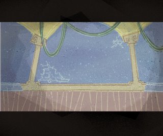
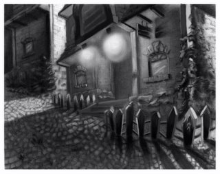
Here's an interesting shot. I won't go into detail, but in this shot something pleasant is presented , hence the brightish yellow and blue. However, everything else around it is still dingy. I think I can still bring that out in this shot. I'm looking forward to getting this painting done, then i'm done my BG paintings and graduate solely onto animation.
Friday, February 24, 2006
1-10 Items only...Severed heads not included.
 If I was copolla, I would have used a severed Pug head instead of a horses head in The Godfather just for the comedic value alone.
Anyway, still trucking alone here, i'm using a combonation of blur, sharpen and noise brushes to get rid of the fact that the texture is too airbrushy. Sharpen and noise give it a simulated short hair effect. I'll post a rotation soon when I dirty up the texture to make it look more furlike.
Round Mound of Hound
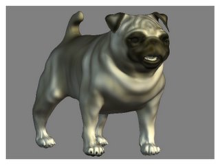 This is more like a progress report post. I've gone into further detail in zbrush with texture colour as well as shaping some teeth for the bugger.
Here's a tip to all 3D students out there: it's obvious to keep eyeballs as seperate objects, but things like teeth, claws, and tongues should be seperate too. A number of things can happen if you dont sepearate these objects:
1) Rigging problems; it would be a pain to paint influences if the toungue was connected to the main object
2) Geometry resolution problems, specifically when modelling with ZBrush; I've run into it specifically with this model. I havent had enough geometry to work with once I got down to the claws and teeth.
Anyway, this is up for critique on CGtalk for those interested, you can find it here:
http://forums.cgsociety.org/showthread.php?p=3273720#post3273720
Sunday, February 19, 2006
A Quick Post
Thursday, February 16, 2006
3D Head Busts, 3 for a $1.25
 Granted, it isnt as refined as the Pug model, but it's a good start. You can still see the faceted polys. I'll come back to this guy, but I suspect that i'll finish the pug first before this dude. Even more likely is a new model to come. I've been toying with the idea of 3D characatures of celebrities.
Wednesday, February 15, 2006
A tricky shot
 Hmmm....not entirely sure how I feel about this one. This is intentionally supposed to be a dingy looking shot hence the chaos. With the previous BG's there was an instant where the painting felt done and uniform. I didnt really get that with this BG. Perhaps its the composition and how the shapes are reading. Im pretty sure I will give this BG an edit when I come back to it with a fresh pair of eyes
Sunday, February 12, 2006
Check the pharmacy section for all your Zbrush needs
Saturday, February 11, 2006
Not the most exciting but...
First work in progress post
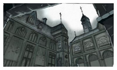
In third year, we never really got the chance to explore and further develop our own layout talents. Right about 2 weeks before christmas break, I had an idea in my head that I had to translate and it was this piece. Since im really busy contributing to our group film at school, its a bit challenging to find time for your own work. When I do have time though, i'd rather spend it on 3d works.
Friday, February 10, 2006
More Layouts

"Everything should be made as simple as possible, but not simpler." -Albert Einstein.
I think the UPA artists had this in mind when they were forming together an identity. Anyway, This is another layout I just finished for our group film. Its an interesting style to adapt too, but I think that this layout is more successful than my previously posted one.
Tuesday, February 07, 2006
Lifedrawing


My lifedrawing isn't really the greatest, but now and again, you come across a drawing that has bits and pieces working for it. I think in 3rd year, the instances of those bits and pieces coming together are alot more frequently for me than in past years. I'm starting to like it more. I think we have a great instructor too.
All of these are 5 minute drawings.
Monday, February 06, 2006
A Tribute to Mary Blair
Sunday, February 05, 2006
More Second Year Work
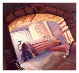 Another second year piece (Dec. 2004) The linework concept is attributed to an anonymous artist. I decided to use the linework for a colour study. I love painting analogously. It's the quickest and easiest way to keep your painting unified. Red was perfect in this situation because it gives the piece that rustic look as well as an overall intensly dangerous feeling.
Subscribe to:
Comments (Atom)
